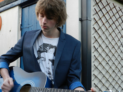
This is the original version of the image on my front cover. I have edited the contrast and brightness to enhance the photograph. The problem with this inage is that it is quite dark and there is a shadow over his eye which needed edited and lightened. I had Alex (the subject matter) model by playing the guitar and had his clothes chosen for the shoot.
This was the photograph that was used on my final front cover. I used this one because the photograph was a better quality and it broke the conventions of music magazine subject matters.
This photograph was used for my double page spread. I felt that it didn't need editing because the image was already quite good quality and didn't need changing. The image itself captured the subject matter (Alex) on a angle and in mid-strum. I felt this was quite effective.
This photograph was also used on my double page spread. This photograph also was presented unedited and unchanged becasue the photo was already good quality so it didn't need changing. The photo was taken at a angle with the subject matter (Alex) modeled by having him crouched down and looking over at my friend.
This photograph was used on my contents page. The photograph has not been edited and was just used as it is. The photo was taken at a upwards angle.


 This photograph was used on my contents page. The photograph has not been edited and was just used as it is. The photo was taken at a upwards angle.


