Natalie's AS Media: Magazine Blog
Tuesday, 13 March 2012
Friday, 10 February 2012
Thursday, 9 February 2012
Audience feedback
- I asked some people from my target audience and I was surprised when they reacted in a mainly positive way.
‘I would defiantly buy this magazine!’
‘The only fault is that the price is a little too high for me’
- I made some small survey questions to ask 10 people
1. Would you buy this magazine?
Yes: 64% No: 36%
2. Does this magazine look professional?
Yes:87% No: 13%
3. Do you think this magazine is sufficient in representing Indie music?
Yes:58% No:42%
Friday, 6 January 2012
Photographs
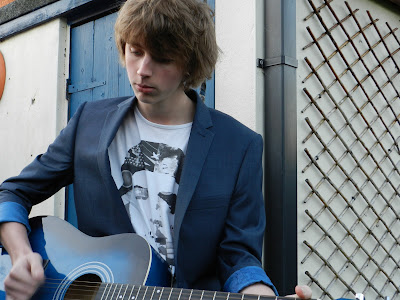
This is the original version of the image on my front cover. I have edited the contrast and brightness to enhance the photograph. The problem with this inage is that it is quite dark and there is a shadow over his eye which needed edited and lightened. I had Alex (the subject matter) model by playing the guitar and had his clothes chosen for the shoot.
This was the photograph that was used on my final front cover. I used this one because the photograph was a better quality and it broke the conventions of music magazine subject matters.
This photograph was used for my double page spread. I felt that it didn't need editing because the image was already quite good quality and didn't need changing. The image itself captured the subject matter (Alex) on a angle and in mid-strum. I felt this was quite effective.
This photograph was also used on my double page spread. This photograph also was presented unedited and unchanged becasue the photo was already good quality so it didn't need changing. The photo was taken at a angle with the subject matter (Alex) modeled by having him crouched down and looking over at my friend.Wednesday, 28 December 2011
Thursday, 15 December 2011
Music Magazine Contents Page
 This was my original version of my contents page before I did some futher editing. After evaluating this design again, I decided that the coverlines could be neater and more professional. I also decided to change the way the numbers hovered at the end of the coverlines and seemed a bit random. I also chose to get rid of the Leeds festival image because I wasn't going to have the magazine have a main article on the festival due to the lack of people who have been to large festivals in my questionnaire. This version of the contents page also didn't have enough pages to make it a surfactant music magazine. This version also didn't use original images from the wombats that were taken by me, unlike the second one.
  This is the second and final design for the contents page to my music magazine. I feel that the layout on this version is better than the previous. I reduced the size of the page numbers to 14pt and added titles to my coverlines in the same style as the numbers. The space in the background at the top right corner was filled with the phrase that I used previously on the cover. I subsituted the image of Leeds festival for the image of Two Door Cinema Club because I felt it was more relevent to the magazine and its target audience.
Subscribe to:
Comments (Atom)


