This is the finished cover of my college magazine. If you compare my front cover to those that have been done professionally I would say mine is quite basic and unprofessional. I think that I could have come up with a better masthead for my magazine because it lacks imagination and isn't very creative. I woulod also use a better pixellated photograph and edit the photographs neater.
The quality of the front cover photograph is quite pixellated seems to be a yellow colour. if I was doing this image again I would take the photograph on a plainer background because on this photograph it was very busy in the background before I edited. If I did this it would have been easier to edit out. For this image I also, did not choose the clothes, hair and make-up for the model and I thought it was also unnecessary considering it was for a college magazine and wasn’t for a fashion or music one where I would think it is necessary. In this photograph her facial expression is neutral and her direction of gaze is on her pad. This photograph gives the appearance of being unstaged.
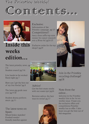
For the contents page I stuck with the silver background to make it link in with the cover page. The general design is similar to that of the cover page. I did use the same font for the name of the magazine and used the same effect' drop shadow' on it. The masthead 'Contents' was given a white 'drop shadow' and was coloured black to keep up with the set theme I had for the magazine (white, black and silver.) For the contents I used the total of four photographs and had them layed out on the three different columns which I also used to arrange the contents. The style of the editorial I used was informal and speaks directly to the reader about the magazine's content. I chose the photographs I did because they linked in with the converlines and subheadings.


No comments:
Post a Comment