Wednesday, 28 December 2011

Thursday, 15 December 2011
Music Magazine Contents Page
 This was my original version of my contents page before I did some futher editing. After evaluating this design again, I decided that the coverlines could be neater and more professional. I also decided to change the way the numbers hovered at the end of the coverlines and seemed a bit random. I also chose to get rid of the Leeds festival image because I wasn't going to have the magazine have a main article on the festival due to the lack of people who have been to large festivals in my questionnaire. This version of the contents page also didn't have enough pages to make it a surfactant music magazine. This version also didn't use original images from the wombats that were taken by me, unlike the second one.
  This is the second and final design for the contents page to my music magazine. I feel that the layout on this version is better than the previous. I reduced the size of the page numbers to 14pt and added titles to my coverlines in the same style as the numbers. The space in the background at the top right corner was filled with the phrase that I used previously on the cover. I subsituted the image of Leeds festival for the image of Two Door Cinema Club because I felt it was more relevent to the magazine and its target audience.
Music Magazine Front Cover
 This was my original version of my music magazine but it waas pointed out that it broke the conventions of a magazine because his face was angled away from the camera. The photograph itself was quite good but becasue it only shows half of his face was cosidered a bad photograph to use.
  I felt that the picture quality let the cover down as it was quite blotchy. The general syle of the cover did work quite well but, seemed lacking. After asking people from my target audience I came to the conclusion that a vast majority of people prefered the other magazine covers over this one. I changed the title of this version but did not like the final result of this cover as it seemed very unprofessional.
 This was more of a conventional music magazine cover but didn't give the the impression of a music magazine. So although it was a facing-the-camera photograph, it is not the cover I would use for a Indie magazine.
 Monday, 21 November 2011
Conventions of a Double Page Spread
-One main photograph dominates the two pages.
-There is a set colour scheme.
-Quotes have been extracted and made larger.
-Drop Capitals are featured.
-Stand firsts are at the beggining of the articles.
-The writing is in columns on all articles.
-The text is quite small for the articles. Long articles
-The captions anchor the meaning of the photographs.
-Each article has a title in large text.
-Bi-lines has the photographer's name or author's name.
-Photos show the subject/artist in interesting poses/costumes.
Photos maybe in a frame or without a frame.
Sunday, 20 November 2011


Friday, 18 November 2011
Researching The Market Place

Because there are many versions of magazines that focus on alternative and rock music my

NME:
Price: £2.40
Frequency of publication: It’s a weekly magazine.
Issue Size:
Regular content: reviews section, gig guide, live reports, the best new music, news, interviews
Feature articles: the biggest bands, the latest on festivals.

Kerrang!:
Price: £2.20
Frequency of publication:
Issue size:
Regular content: review section, gig guide, interviews, news, and the latest band reports.
Feature articles: the biggest band at the moment, exclusives, and announcements.
Sunday, 13 November 2011
As Media Research
My questionnaire

I asked 20 people of the aged 16-25 because it is my target audience and gave me a clearer idea on what they would like to see featured in my music magazine.

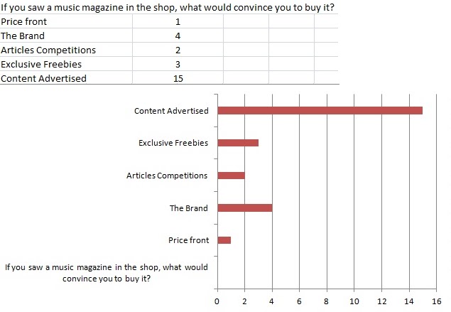
This information told me that the content on the front cover of my magazine is very important to my target audience and will convince people to buy it. It also, shows that people like to buy things becasue of the brand.

I asked this question to see whether or not a clothes section should be featured in my magazine. I also wanted to see how many people are influenced by the music scene.

The majority of people prefer to listen to their MP3/iPods which suggests that I should add a technology section to my magazine about the best headphones, best music platforms ie/ iPods, Dockingstations. Also, I will add a free downloading code with every issue so people can a free CD online in every issue.

The majority of people have seen a band in the past before. This suggests that I can have competitions where the prize is concert tickets. Also, a gig guide will be featured in my magazine so the audience knows when their favourite band will be playing.

These results help give me an idea on who my largest competitors are.

These results give me an idea on which style of music I should focus on. I was originally having my music magazine be evolved around indie and rock music so these results fit in well.

From these the results I can now come to a decision on what will be in the content of my magazine. These results give me an insight on what the target audience would most like to see featured. They also tell me how much I should charge the public. Because there is such a small number of people that have been to festivals due to the target audiences age, feastivals will not be covered in my magazine often. But I will have competitions in my magazine where the prizes are tickets to festivals like Leeds and Glastonbury.
Monday, 7 November 2011
Research: The Music Magazine Industry
Magazines exist as a business to make money for their owners (usually the publishers.) Even with there being in the UK over 3000 different ‘consumer’ magazines, most of the main big titles eg. Kerrang, NME are owned and published by a relatively small number of publishing companies. These companies often publish magazines that are quite competitive with other leading magazines similar to themselves. For example: Q and NME.

But for most of these magazines the main area in which they make their money is advertising. They make their money doing this by selling advertising spaces – “selling eyeballs to advertisers.” Advertisers like using magazines because they are enable to reach specific “niche” audiences as well as magazines are a more efficient way of advertising rather than television.

Publishers also have to keep a close eye on their circulation figures – ie/ How many magazines they are selling each week and month. They have to do this because it is a very competitive market so they must keep up to date on who is selling the most magazines. These circulation figures are gathered by the Audit Bureau of Circulations (ABC.)
Music Magazines:
The publishing company IPC publish the magazines NME and Uncut.
NME's current circulation figures fell 14.3% to 29,020 in the first half of 2011.
Uncut's current circulation figures fell 10.9% and are 66,004
The publishing company Baver publish the magazines Kerrang, Q, and Mojo.
Kerrang's current circulation figures fell 2.2% to 43,033
Q's current circulation figures fell 10.1% year on year and is currently 80,418
Mojo's current circulation figures fell 4.8% year on year but is still the biggest selling magazine at 87,262
The company Future Publishing publishes magazines like; Classic Rock, Matal Hammer, and Total guitar.
Further Music Magazines that appeal to different audiences and have a different musical focus:
The Rolling Stones.
is a US-based magazine devoted to music, liberal politics, and popular culture that is published every two weeks. Rolling Stone was founded in San Francisco in 1967 by Jann Wenner (who is still editor and publisher) and music critic Ralph J. Gleason.
 Cyclic Defrost.
  Clash.
Music Magazines:
The publishing company IPC publish the magazines NME and Uncut.
NME's current circulation figures fell 14.3% to 29,020 in the first half of 2011.
Uncut's current circulation figures fell 10.9% and are 66,004
The publishing company Baver publish the magazines Kerrang, Q, and Mojo.
Kerrang's current circulation figures fell 2.2% to 43,033
Q's current circulation figures fell 10.1% year on year and is currently 80,418
Mojo's current circulation figures fell 4.8% year on year but is still the biggest selling magazine at 87,262
The company Future Publishing publishes magazines like; Classic Rock, Matal Hammer, and Total guitar.
Further Music Magazines that appeal to different audiences and have a different musical focus:
The Rolling Stones.
is a US-based magazine devoted to music, liberal politics, and popular culture that is published every two weeks. Rolling Stone was founded in San Francisco in 1967 by Jann Wenner (who is still editor and publisher) and music critic Ralph J. Gleason.
 Cyclic Defrost.
Is Australia's only specialist electronic music magazine. they cover independent electronic music, avant-rock, exprimental sound art and leftfield hip hop.
The Fly.
Is a free music magazine published monthly in the UK. It is published by the HMV owned MAMA Group. The magazine has a review section featuring new eleases and live concert reviews. The remainder of the magazine is articles and intervies artists promoting new releases or tours. It also features new bands alongside more established bands.
 Clash.
Is a popular music and fashion magazine based in the UK. The magazine alternates between moder bands such as Coldplay and The Prodigy as well as hip-hop artists. It features reviews of music, films and igh street fashion as well as interviews with music stars and sections on new music.
Magnet.
is a music magazine that focuses on alternative, independent or out of the mainstream bands. The magazine is published four times a year, and is independently owned and edited by Eric T. Miller. The magazine's content tends to focus on up and comingindie bands and expositions of various music scenes
Sunday, 6 November 2011
Original Photographs


Sketches of the Cover and Contents Page

This was my first sketch design for the front cover of my collage magazine. If you compare this to my final front cover you can see that I did not change much in my design. I kept the original design because I liked the basic layout of it and the elements to the page.

For the contents page I also like the cover stuck with the original design quite a bit. But because this sketch was very basic quite a lot had been added onto the final contents page's design.
Friday, 4 November 2011
The Finished Cover Page and Contents Page
This is the finished cover of my college magazine. If you compare my front cover to those that have been done professionally I would say mine is quite basic and unprofessional. I think that I could have come up with a better masthead for my magazine because it lacks imagination and isn't very creative. I woulod also use a better pixellated photograph and edit the photographs neater.
 Cover Page:
The quality of the front cover photograph is quite pixellated seems to be a yellow colour. if I was doing this image again I would take the photograph on a plainer background because on this photograph it was very busy in the background before I edited. If I did this it would have been easier to edit out. For this image I also, did not choose the clothes, hair and make-up for the model and I thought it was also unnecessary considering it was for a college magazine and wasn’t for a fashion or music one where I would think it is necessary. In this photograph her facial expression is neutral and her direction of gaze is on her pad. This photograph gives the appearance of being unstaged.
 Contents Page:
For the contents page I stuck with the silver background to make it link in with the cover page. The general design is similar to that of the cover page. I did use the same font for the name of the magazine and used the same effect' drop shadow' on it. The masthead 'Contents' was given a white 'drop shadow' and was coloured black to keep up with the set theme I had for the magazine (white, black and silver.) For the contents I used the total of four photographs and had them layed out on the three different columns which I also used to arrange the contents. The style of the editorial I used was informal and speaks directly to the reader about the magazine's content. I chose the photographs I did because they linked in with the converlines and subheadings.
Thursday, 3 November 2011
Initial Ideas - College Magazine. Ideas for content.
-Up-coming events
-College trips
-Advice and tips
-Job oppertunities
-News
-Students and achievments
-Drama and Performing Arts productions
-Reviews ie/ games, gigs, films
-Sport: Match reports, match times, and results.
-Art exhibition times and information.
-College trips
-Advice and tips
-Job oppertunities
-News
-Students and achievments
-Drama and Performing Arts productions
-Reviews ie/ games, gigs, films
-Sport: Match reports, match times, and results.
-Art exhibition times and information.
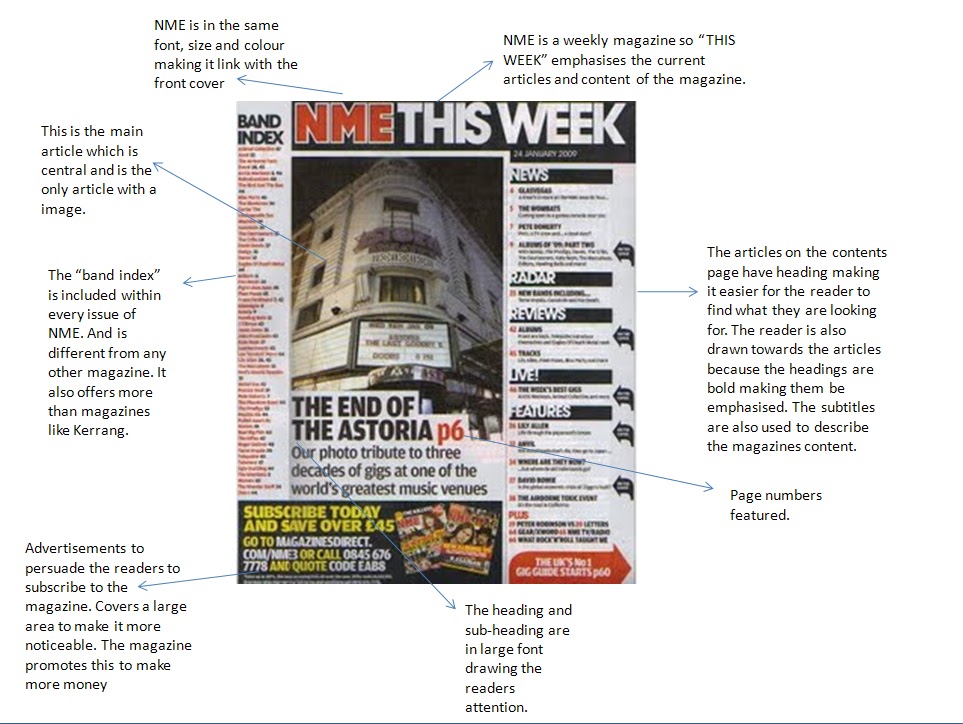
Conventions of a Magazine Contents Page - Initial Research
 -A message from the editor (editorial.) This tells the reader about the magazine's contents infornally by someone involved in the production of it.
-Pictures, page numbers and the contents all go in groups.
-The content is listed usually down the page.
-Advertisements on how to buy the magazine ie/ online subscription are at the bottom of the page.
-Words around the pictures 'anchor' them.
-A colour scheme of the magazine is repeated.
-The more important stories are larger that the minor stories.
 -Sometimes pictures of important pages are featured. eg. Compotition pages, free poster.
-A small number of different fonts and font sizes are used.
-Substories ans subheadings are both used for seperating the sections of the magazine.
-Repatition is used on the Logo and Title of the magazine. This is usually featured at the top of the page.
-The photographer's name is featured on the photograph.-There is also a lack of empty spaces.
Tuesday, 11 October 2011
Conventions of a Magazine Front Cover - Initial Research
 -Text layering is used: Masthead goes behind main image. Coverlines goes on top of the images. Text never covers the face.
-Words like 'etra' and 'exclusive' are used to lure the reader.
-They all have a colour sheme for the text. No more than five colours are used. Making the text stand out from the rest.
-Expression on the face of the subject in the photographs convays their 'attitude'.
-Don't use to may different fonts. A small number of fonts and font sizes.
-Anchorage is used. text is added to cover the image to explain the photograph.
-The image is usually a medium close up shot with font on the lower body.
-The issue number and price are in small fonts.
-Coverlines indicate sub-stories explaining the magazines content.
-The text is written in an entertaining style to 'lure' the readers.
-Exclamation marks are exaggerated to show how exciting the magazine is.
-The masthead creates a 'brand identity' in a style and fond as well as connotations.
-Capital lettering is used for the main coverlines.
-Compatitions and freebees are emphasised.
-The background is very plain.
-The subject in the image is usually looking at the camera.
-Coloured banners maybe used across the page.
-The clothing of the cover image reflects the personality of the celeb.
Subscribe to:
Comments (Atom)